COVID visuals - daily new cases per million
Load libraries
library(tidyverse)
library(rvest)
library(slider)
Input data - Worldometer
The data is scraped from a table in Worldometer coronavirus site
Why yesterday? Because, today’s data is incomplete, since not all countries update data at the same time.
worldometer_url <- "https://www.worldometers.info/coronavirus/#countries"
covid_yesterday <- read_html(worldometer_url) %>%
  html_node(xpath='//*[@id="main_table_countries_yesterday"]') %>%
  html_table() %>%
  as_tibble()
Clean and analyze data
covid_yesterday %>%
  janitor::clean_names() %>%
  filter(!is.na(number)) %>%
  select(country_other,new_cases,population) %>%
  mutate(across(c(new_cases,population),parse_number)) %>%
  top_n(20,new_cases) %>%
  mutate(new_per_1m=new_cases/population*100000, pop_m=round(population / 1000000, 2)) %>%
  select(-population) %>%
  arrange(-new_per_1m) %>%
  head(10) %>%
kable(caption = "Top 10 countries with highest new cases per million")| country_other | new_cases | new_per_1m | pop_m |
|---|---|---|---|
| Ireland | 13765 | 274.23482 | 5.02 |
| Denmark | 9564 | 164.26196 | 5.82 |
| France | 104611 | 159.74215 | 65.49 |
| Portugal | 10016 | 98.65386 | 10.15 |
| Italy | 54761 | 90.76889 | 60.33 |
| Netherlands | 12564 | 73.08467 | 17.19 |
| Greece | 6590 | 63.68606 | 10.35 |
| Belgium | 7233 | 62.00966 | 11.66 |
| Australia | 9947 | 38.34949 | 25.94 |
| Canada | 13439 | 35.15116 | 38.23 |
Another input data - John Hopkins Univ
initial <- read_csv("https://raw.githubusercontent.com/CSSEGISandData/COVID-19/master/csse_covid_19_data/csse_covid_19_time_series/time_series_covid19_confirmed_global.csv") %>%
  janitor::clean_names()
Overall plot is quite crowded so I handpicked several countries.
select_countries <- c("Turkey","Brazil","US","Poland","Germany")

p <- initial %>%
  filter(country_region %in% select_countries) %>%
  select(country_region, starts_with("x")) %>%
  pivot_longer(-country_region, names_to="date", values_to="cases") %>%
  mutate(date=str_remove(date,"x")) %>%
  mutate(date=str_replace_all(date,"_","/")) %>%
  mutate(date=parse_date(date,"%m/%d/%y")) %>%
  mutate(new_case=cases-lag(cases)) %>%
  filter(!is.na(new_case), new_case > 0, new_case < 400000) %>%
  ggplot(aes(date,new_case, color=country_region)) +
  geom_line()

p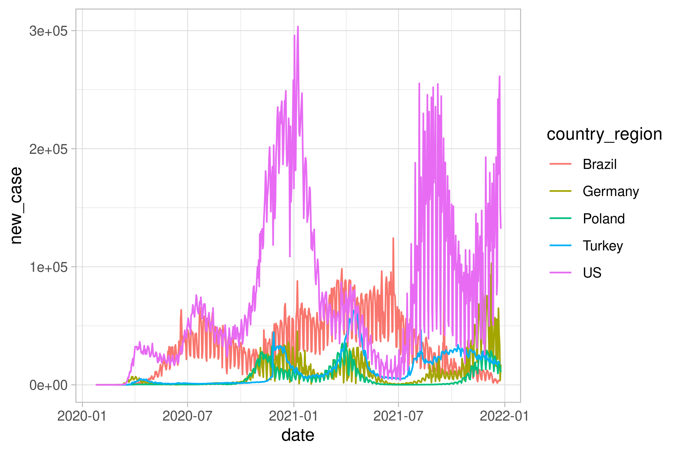
The plot is too rugged. Let’s do weekly average by using excellent slider::slide function (instead of zoo::rollmean)
initial %>%
  filter(country_region %in% select_countries) %>%
  select(country_region, starts_with("x")) %>%
  pivot_longer(-country_region, names_to="date", values_to="cases") %>%
  mutate(date=str_remove(date,"x")) %>%
  mutate(date=str_replace_all(date,"_","/")) %>%
  mutate(date=parse_date(date,"%m/%d/%y")) %>%
  mutate(new_case=cases-lag(cases)) %>%
  filter(!is.na(new_case),
         new_case > 0,
         new_case < 400000) %>%
  mutate(new_case_roll= slide_dbl(new_case,
                                  mean,
                                  .before = 6)) %>%
  ggplot(aes(date,new_case_roll, color=country_region)) +
  geom_line() -> p2

p2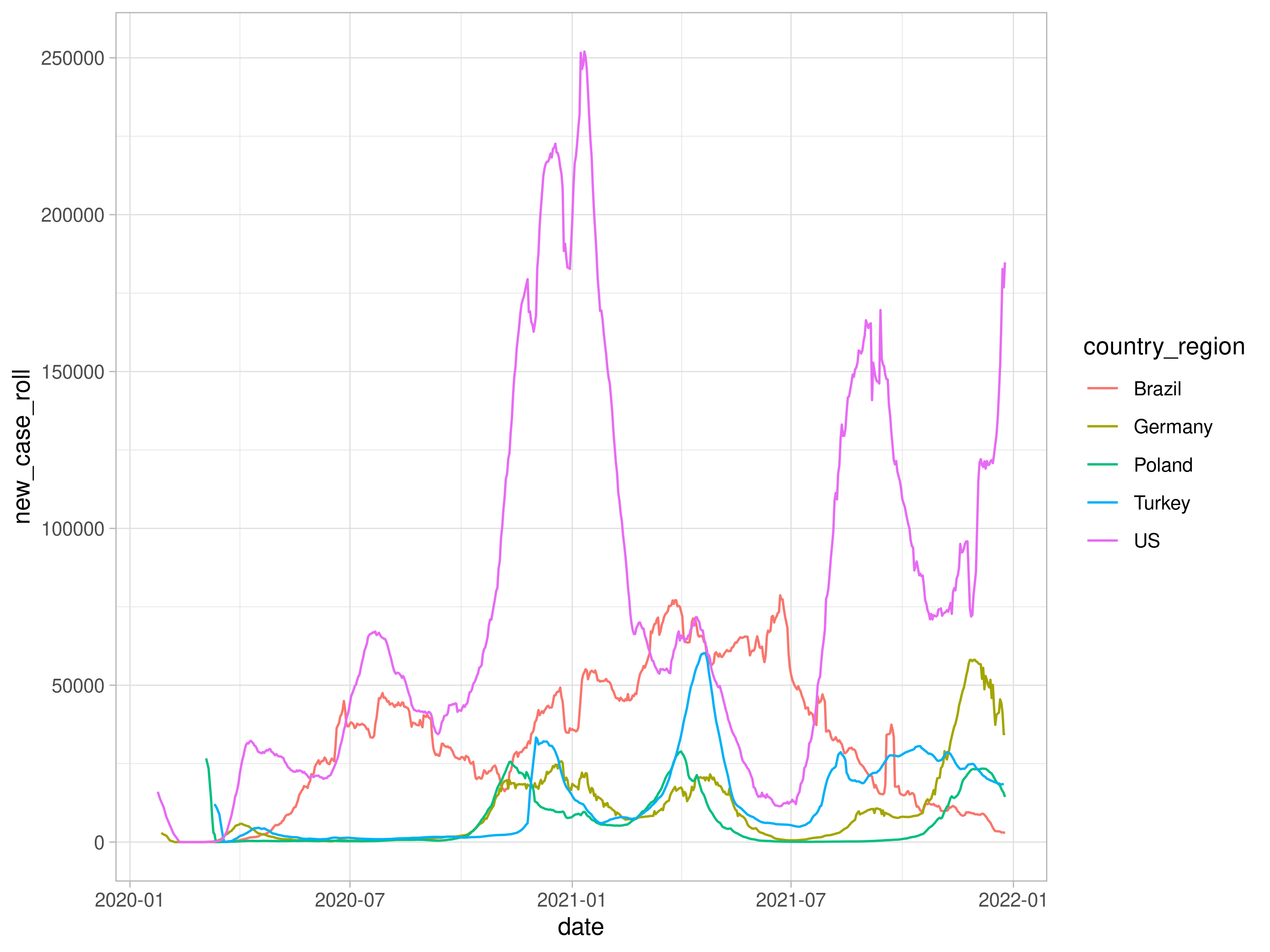
using plotly package, we can have interactive results by issuing ggplotly(p).
library(plotly)

ggplotly(p2)